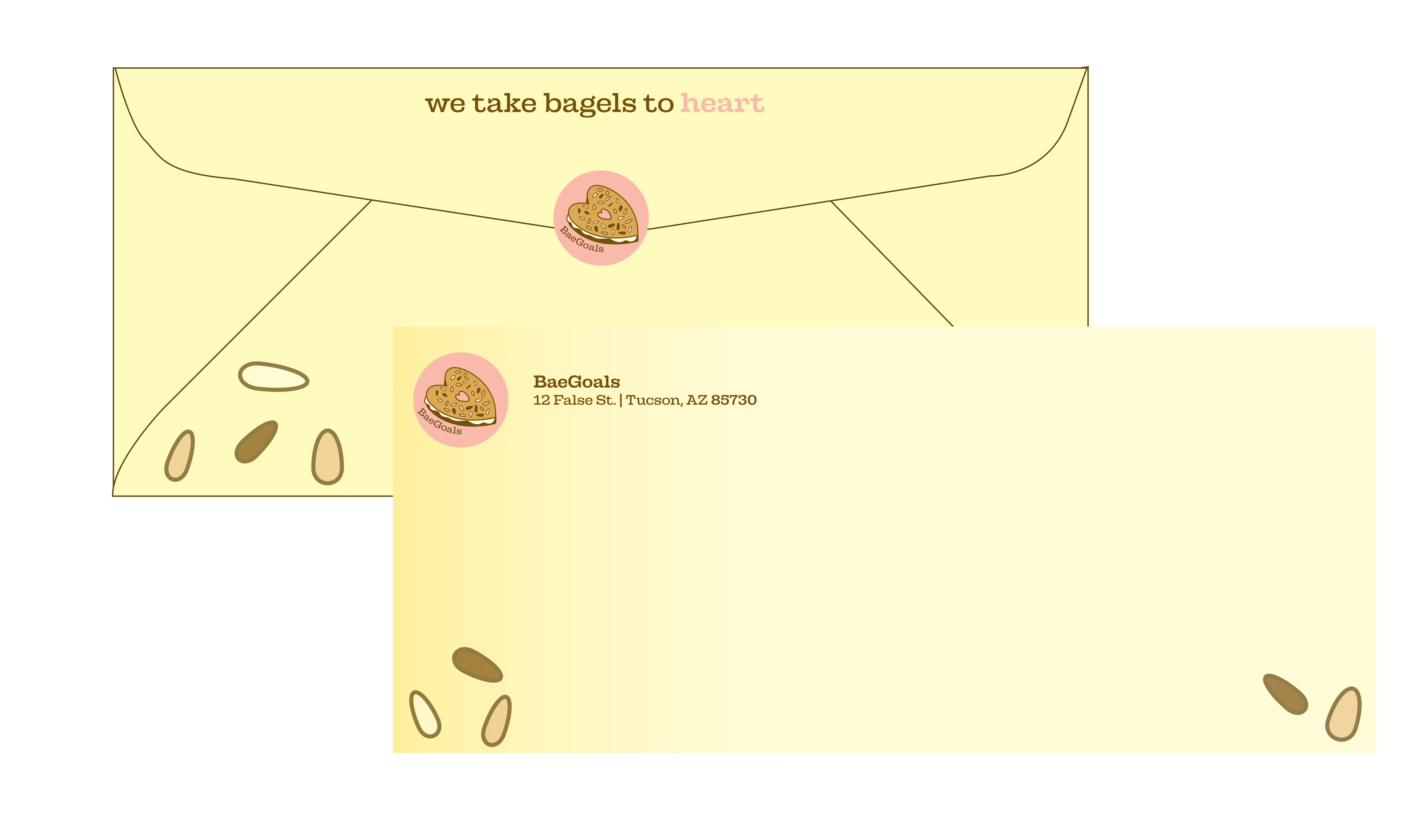
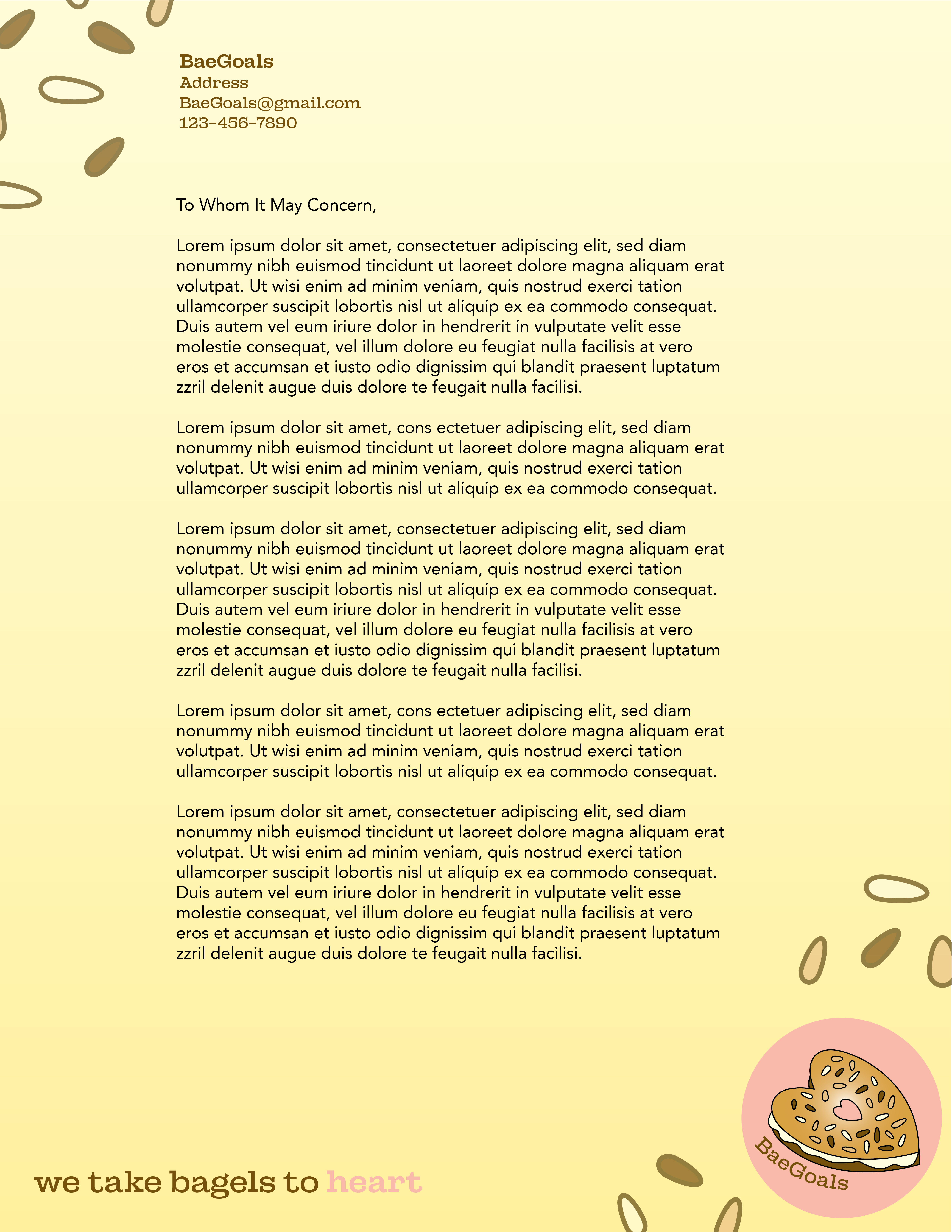
BaeGoals is a case study for a wonderful play on words combined with yumminess. A company that takes bagels to heart, they focus on the basics in what they offer. The brand imagery focuses on a cute aesthetic with subtle outlines and soft colors throughout.
Font
Fonts used throughout the branding kit are Campaign Slab and Avenir Roman/Black.
Logo
The logo here is representative of the brand’s strapline. It’s typically used in the bottom right hand on their branding materials.
Color
The colors used throughout the brand are shades of yellow, pinks, and browns. They’re simple and fall into a cute, soft category that don’t feel harsh on the eyes or heart.


