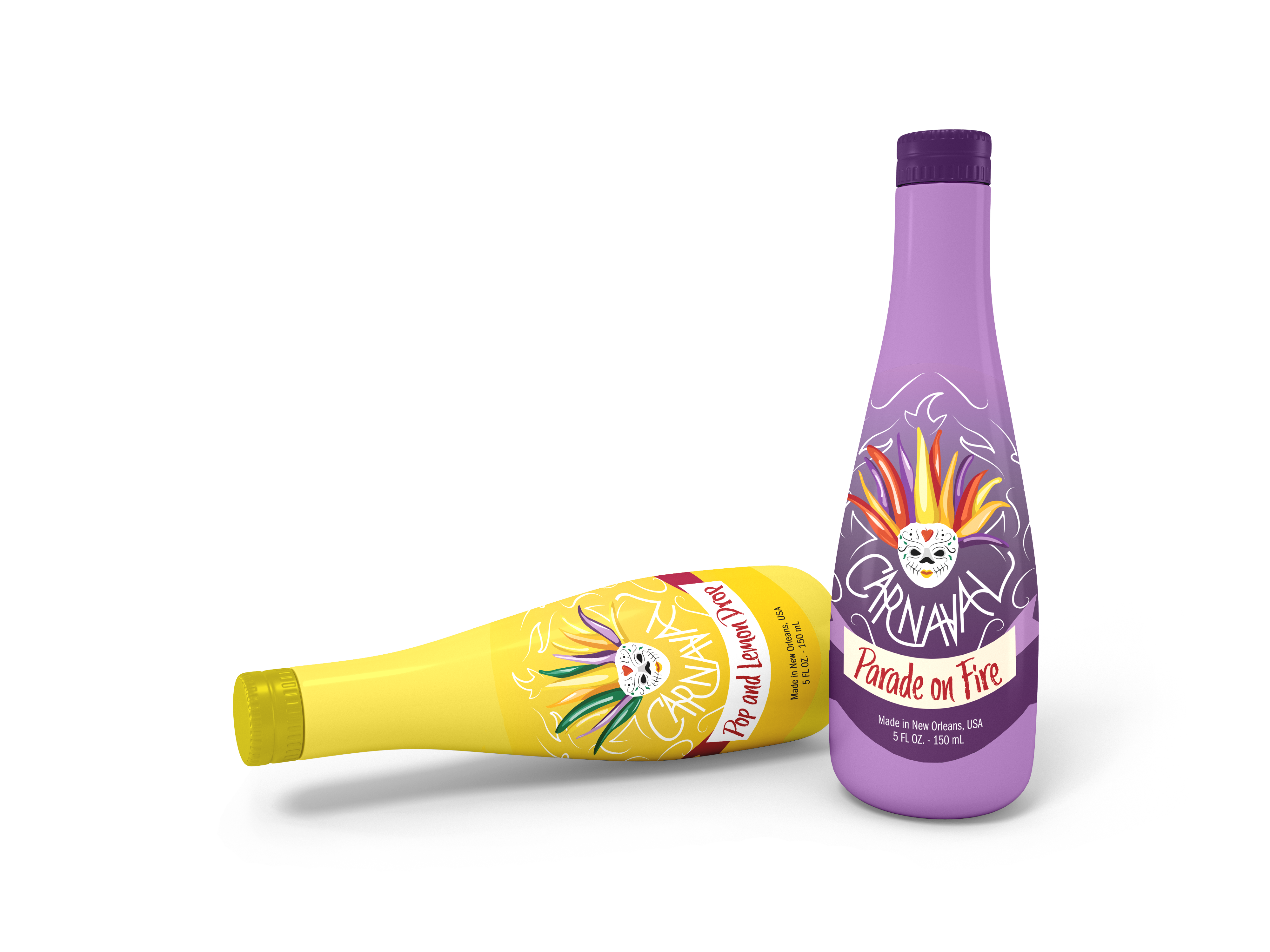
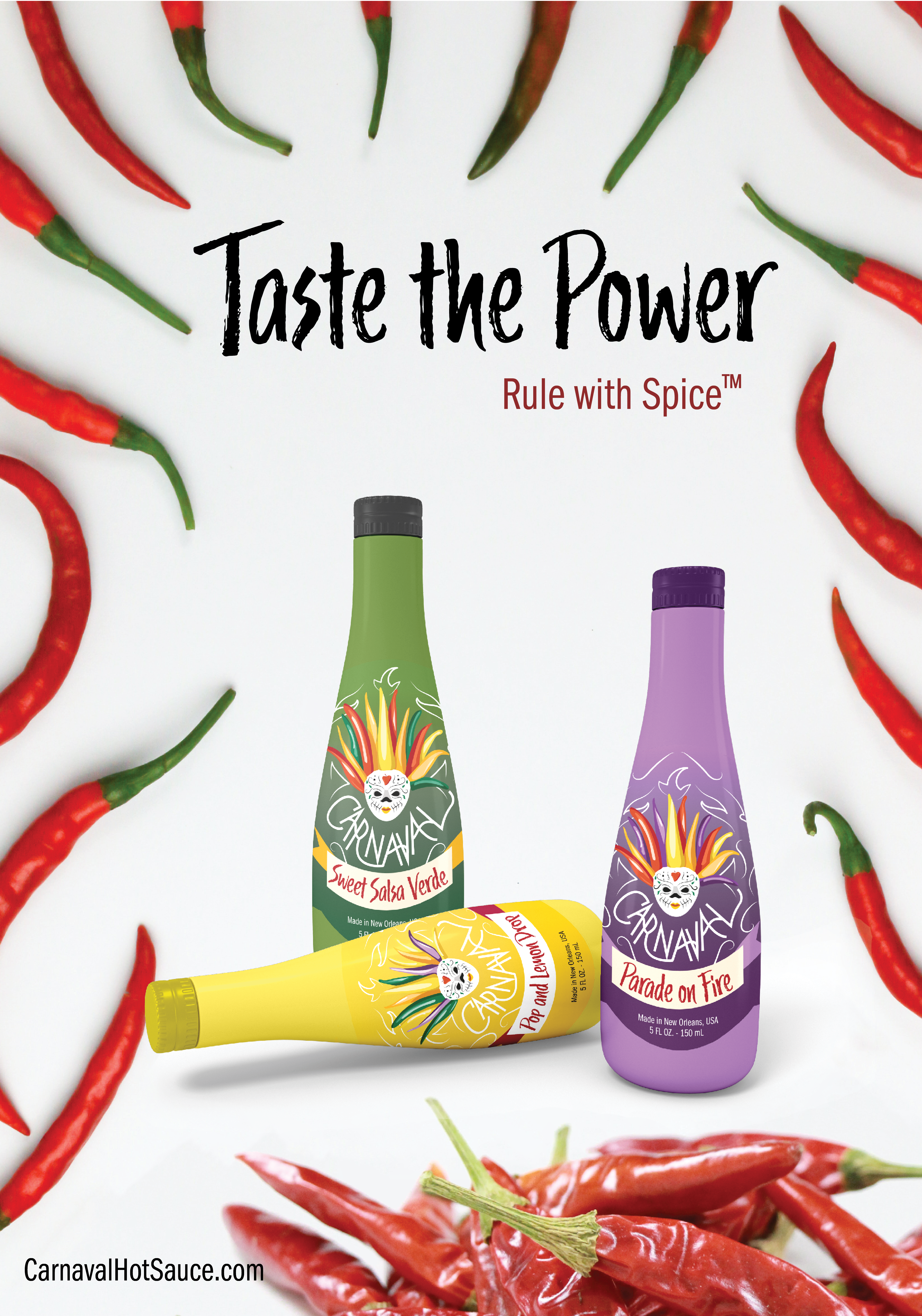
Carnaval Hot Sauce was branded and designed to be the perfect combination of Carnival and Mardi Gras. I took elements of both festivals that feel similar, as discussed below, to create a line of hot sauces that are supposed to be the ultimate festival for your mouth.
Font:
The header fonts used throughout is Trailmade. The body copy is FranklinGothic URW Comp Book. The word “Carnaval” is hand drawn.
Logo:
The logo was based on a collaboration of imagery from Carnival and Mardi Gras. I looked especially masks from the Zulu parades and the colors and costumes, particularly the headwear from Carnival. Together, I formed the masks that function as the logo, each varying depending on flavors.
Color:
I stuck with the yellow, green, and purple color profiles of Mardi Gras for the sauces themselves. For the logos, I worked on including bright, eye catching colors seen in Carnival (and spicy peppers in general) like the reds, yellows, and so on.